Branding: Logos, Colors and Signage
March 13, 2017
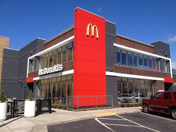
 McDonald’s encompasses everything this first installment is about. Their logo, the yellow arches against the red background and their signage have remained true with minor tweaks for the past 65 years. Anytime a logo can be recognized without the name, you’ve got something special. Although the look of the restaurant and menu have made adjustments to stay competitive in the past several decades, they’ve remained consistent with their logo, colors and signage. Consistency is key for any business big or small. If McDonald’s allowed each individual franchise owner to deviate from the original logo the brand awareness would be significantly lower because there would be no consistency and consumer “peace of mind” about the product.
You must become proactive in making your business stand out from the rest. Your first and possibly one of the most important steps of branding yourself is to design a logo that is recognizable at a glance and use it on everything. So many people have an amazing logo, but they don’t utilize it to its maximum potential. The best way to utilize it is to use it on everything—letterhead, labels, business cards, advertisements, websites, and social media, anything that leaves your business and can be seen by anyone. Think of it as a mini sign. You’re creating a brand awareness by doing this, which then leads to a natural buzz about your business. Any sponsorship my husband and I do on behalf of our business must be able to use our logo. This means any sponsorships for 5Ks, sports teams, etc. They absolutely must have the capability to use our logo or we can’t do it. I know that sounds a little harsh, but with today’s technology virtually anyone can do it. Since you’re asking them to use your logo with no changes, you must also do your part by supplying them with useable formats like a high-resolution Vector file or at the bare minimum a jpg. I can’t count the number of times that I’ve done fundraising for a non-profit, asked donors for their logos and they have given me a physical business card. A business card does not a logo make. You may be asking yourself, “How do I do all this and what in the world is a Vector file?” My suggestion is to hire a professional to design a logo for you and they will supply you with the needed formats. I know you’re a small business and you’re thinking that’s going to cost a fortune, it really doesn’t and trust me that small expense now will make you your money back tenfold if used to its full potential.
My personal criteria for working with a logo designer:
1. They need to listen to me and what I’m trying to say through my logo.
2. I need to listen to them and trust their expertise and advice.
 3. They need to be willing to make a few changes until I’m happy with the design. Let’s be reasonable though, you can’t expect them to make 42 changes for you and not get a little short-tempered, but two to three changes is reasonable because if criteria #1 and #2 have been met there shouldn’t be more than that needed anyway.
4. They must be able to give me all of the aforementioned formats.
My idea of a great logo:
1. Simple. Going back to those golden arches…simplicity creates recognizability.
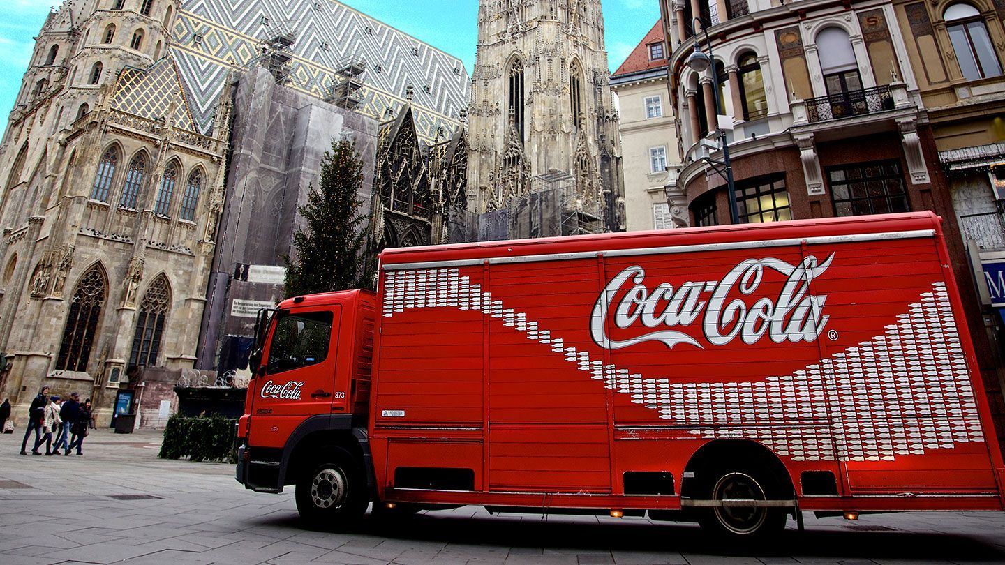
2. One or two colors that show up well at a glance. Personally, I don’t like more than two colors. It just gets too messy and hard to process at a glance. Of course, red is a great color that stands out in print and online. Coca-Cola’s logo is red, Chick-fil-A’s logo is red, and even Pepsi’s logo uses a little red. I’m not saying you have to use red, but try to use a color that stands out. For example, Starbucks doesn’t have even a hint of red, but the green and white contrast is just as effective.
 3. The font, oh, the font. In my opinion, this is where many people mess up a great logo. The font needs to be easy to read and large enough to be seen at a glance. I like a pretty, swirly font just as much as the next guy, but they can be difficult to read and often don’t work well on a sign.
Get a great logo with recognizable colors and your signage will fall into place. As I’ve mentioned, you’re not going to deviate from the logo, so your signage should be a large reflection of it.
I keep mentioning “at a glance” because that is what you literally have from consumers today–a glance. We’re all so busy with raising kids and life that we only have a split-second to devote to a product but the good news is that those split seconds add up in a consumer’s mind and eventually they can turn into profits for you.
CyberSpyder Marketing Services has the tools that you need to create a great logo for your business that will separate you from your competition. Give them a call right now at 479.782.0005 or visit their website at www.CyberSpyder.net.
3. The font, oh, the font. In my opinion, this is where many people mess up a great logo. The font needs to be easy to read and large enough to be seen at a glance. I like a pretty, swirly font just as much as the next guy, but they can be difficult to read and often don’t work well on a sign.
Get a great logo with recognizable colors and your signage will fall into place. As I’ve mentioned, you’re not going to deviate from the logo, so your signage should be a large reflection of it.
I keep mentioning “at a glance” because that is what you literally have from consumers today–a glance. We’re all so busy with raising kids and life that we only have a split-second to devote to a product but the good news is that those split seconds add up in a consumer’s mind and eventually they can turn into profits for you.
CyberSpyder Marketing Services has the tools that you need to create a great logo for your business that will separate you from your competition. Give them a call right now at 479.782.0005 or visit their website at www.CyberSpyder.net.Marketing That Grows Your Business
©2000 - CyberSpyder Marketing Services

